
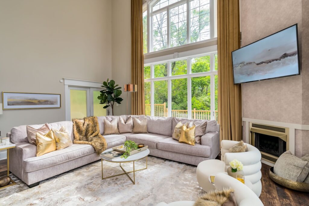
The Master Manifesto: The Physics of Feeling
In the design world, we spend a lot of time talking about what goes with what.
But this summer, we’re pivoting.
We’re not talking about decor.
We’re talking about energy.
Specifically…how the color of your sanctuary dictates the chemistry of your soul.
The Science of the Stare: LRV + You
Before we get into the vibe, let’s talk about the math.
As any science-minded designer knows, light is a wave—and every wave carries energy. In design, we measure this through Light Reflectance Value (LRV).
LRV is a scale from 0% (absolute black, absorbing all light) to 100% (pure white, reflecting all light).
When you choose a color with a low LRV—say, a moody Obsidian—you aren’t just choosing a dark room. You’re creating a gravitational pull. A space that hugs you and holds the light close.
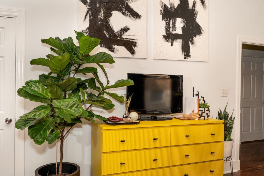
Conversely, a high-LRV yellow isn’t just bright—it’s a literal engine of reflection, bouncing energy back into your space.
Color isn’t passive.
It’s a physiological event.
If your room feels “dead,” it’s not the furniture. It’s probably the photon absorption rate.
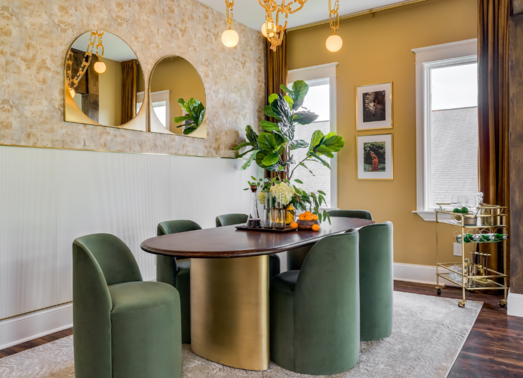
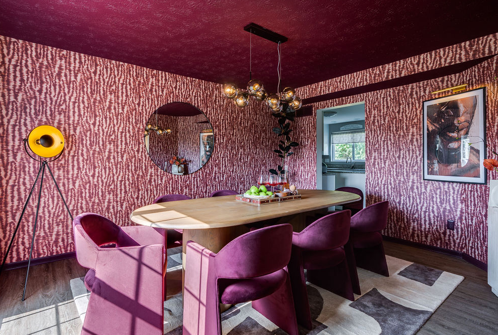
The Four Pillars of the Color Rebellion
1. The Hue-phoria™ Factor
We’re moving past “resale value” neutrals.
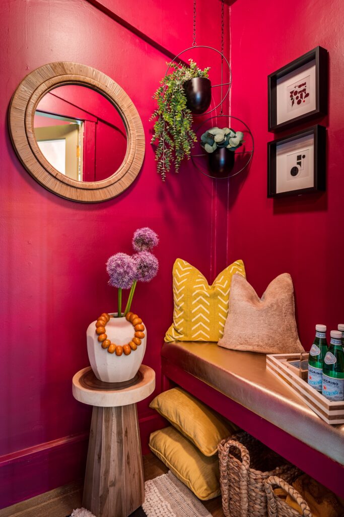
If a neon orchid makes your heart skip a beat—that’s not random. That’s a chemical signal. Your brain responding to a specific frequency.
We call this Hue-phoria™ which means: the moment your environment aligns with your internal rhythm.
“Safe” beige is often just a form of sensory deprivation.
True luxury is a home that functions as a proactive wellness tool.
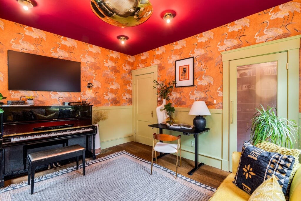
2. The Art of the Clash (Intentional Tension)
Forget the old rules about what “matches.”
Harmony can be boring.
Tension is where the life is.
Clashing isn’t chaos—it’s visual vibration. It keeps the brain engaged.
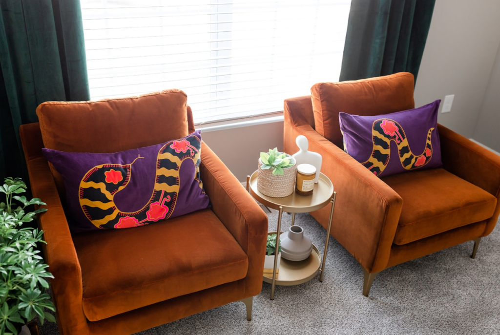
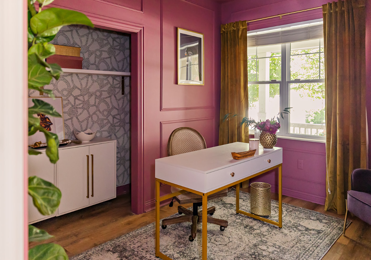
Pair a deep purple with a burnt orange, and you’re not breaking rules—you’re creating a conversation.
Think of it like a complex jazz chord.
To some, it’s dissonant. To others, it’s everything.
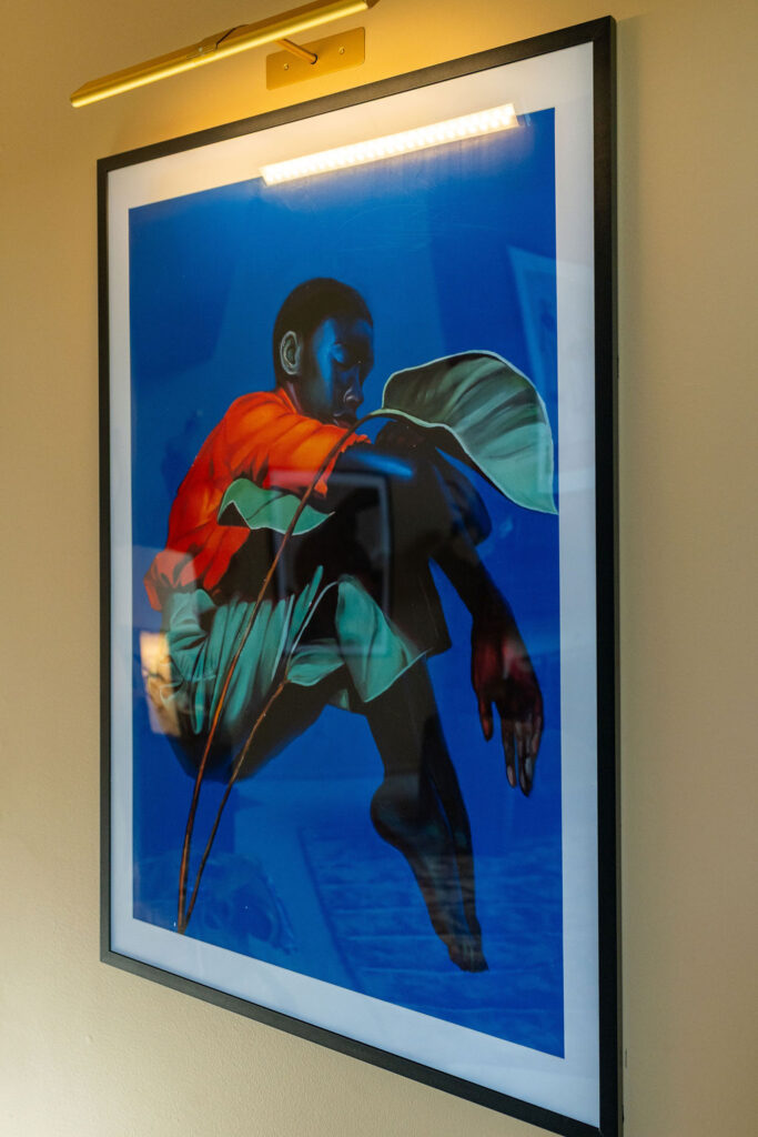
3. Chromotherapy + The Silent Architecture
Nature doesn’t do boring.
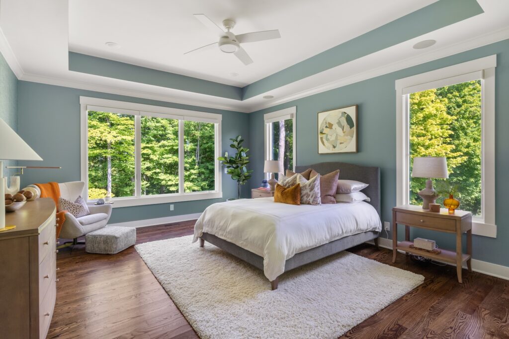
Biophilic color theory shows us that deep moss greens, warm terracottas, and organic tones actually lower cortisol.
Your home should be a mood booster.
A recovery pod.
A creative engine.
All at once.
4. The Anti-Trend Manifesto
Trends are corporate suggestions.
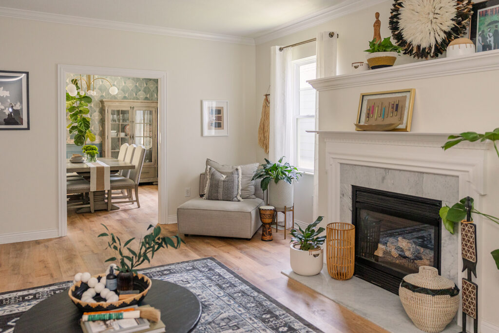
Your authentic palette is personal.
What color was the sky on the day everything clicked for you?
What shade defined your favorite space growing up?
That’s your palette.
Not what’s trending this season.

The Bottom Line
Stop designing for the next person who might own your house.
Design for the person living in it now.
Give your walls a pulse.
They deserve it.
–Twelve15 Design Studio

